Knowledge Without Bottlenecks: Transparency, Data Access, and Analytical Freedom
by Yubin Park, Co-Founder / CTO
Knowledge Without Bottlenecks: Transparency, Data Access, and Analytical Freedom
Introducing Pulse & Sentinel v0.0.13
For too long, healthcare analytics has been constrained by three fundamental bottlenecks: opaque AI that doesn't explain itself, fragmented data scattered across countless sources, and the technical barriers that separate questions from answers.
Today, we're removing all three.
The Problem with Black Box Analytics
When an AI tells you "these ACOs are at risk," what does that actually mean? Which data did it examine? What patterns did it find? What assumptions did it make?
If you can't answer these questions, you don't really have insight. You have a guess wrapped in algorithmic confidence.
Healthcare decisions are too important for opacity. When you're evaluating provider networks, investigating fraud patterns, or identifying care quality trends, you need to understand not just what the answer is, but how you arrived at it. The methodology matters as much as the conclusion.
Three Pillars of Analytical Freedom
With Pulse & Sentinel v0.0.13, we're building healthcare analytics on three foundational principles:
1. Radical Transparency
Our AI assistants now show you their complete analytical process in real-time. You'll see:
- Which specific tools are being used at each step
- Why those tools were chosen
- Which datasets are being accessed
- How data is being transformed and analyzed
- The logic behind every conclusion
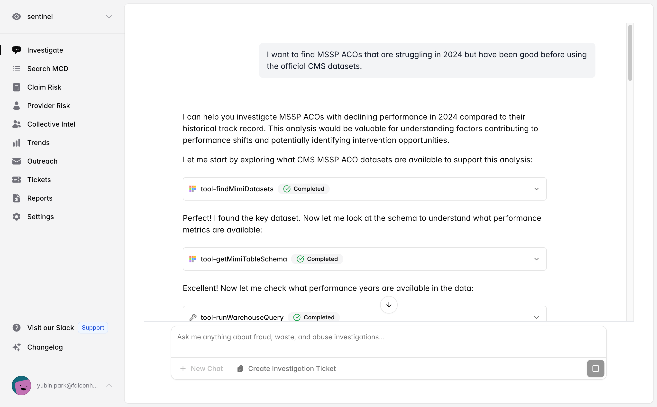
This isn't just about trust, though that's crucial. It's about learning. When you understand the AI's methodology, you ask better questions. You spot edge cases. You develop intuition about your data. Over time, transparency makes everyone smarter.
Top tip
Powered by Claude Sonnet 4.5: Both Pulse Insights and Sentinel Investigator now run exclusively on Anthropic's latest model, ensuring consistent, reliable, and cutting-edge performance across all analyses.
2. Unified Data Access
We've eliminated the bottleneck of fragmented data sources. Your analyses can now seamlessly draw from:
- Your organization data (claims, BCDA data)
- Thousands of Mimilabs public datasets (CMS data, quality metrics, utilization patterns)
- National and historical benchmarks and trends (falon's proprietary data)
- Provider risk indicators (falon's proprietary data)
No more toggling between platforms. No more manual data exports. No more "I need to check another system." Everything you need is unified, indexed, and instantly queryable.
3. Instant Visual Intelligence
Questions deserve answers, not just data dumps. With v0.0.13, every analysis automatically generates publication-quality visualizations:
- AI Chart Generation: Ask complex questions and watch as the AI writes code to create comprehensive charts and graphs
- Automatic Saving: Every visualization is saved to your Reports section with clickable suggestions
- Team Collaboration: Share professional insights instantly with colleagues
- Visual Gallery: Your Reports page displays the latest 3 AI-generated plots with a "Total Charts" summary
The bottleneck between insight and action? Gone.
From Question to Understanding in Minutes
Let's see these principles in action. A user recently asked:
"Create some helpful SDOH map for a national ACO"
Here's what happened:
Transparent Process:
- AI searched Mimilabs catalog for relevant Social Determinants of Health (SDOH) datasets
- Identified the AHRQ SDOH Database with comprehensive county-level metrics
- Queried 2020 data across 20 major US counties
- Analyzed multiple SDOH dimensions: poverty rates, social vulnerability, food insecurity, and insurance coverage
- Generated a multi-panel visualization with geographic mapping
- Annotated critical insights and correlations between SDOH factors
Every step explained in plain language. Every tool choice justified. Every data source cited.
Instant Visualization:
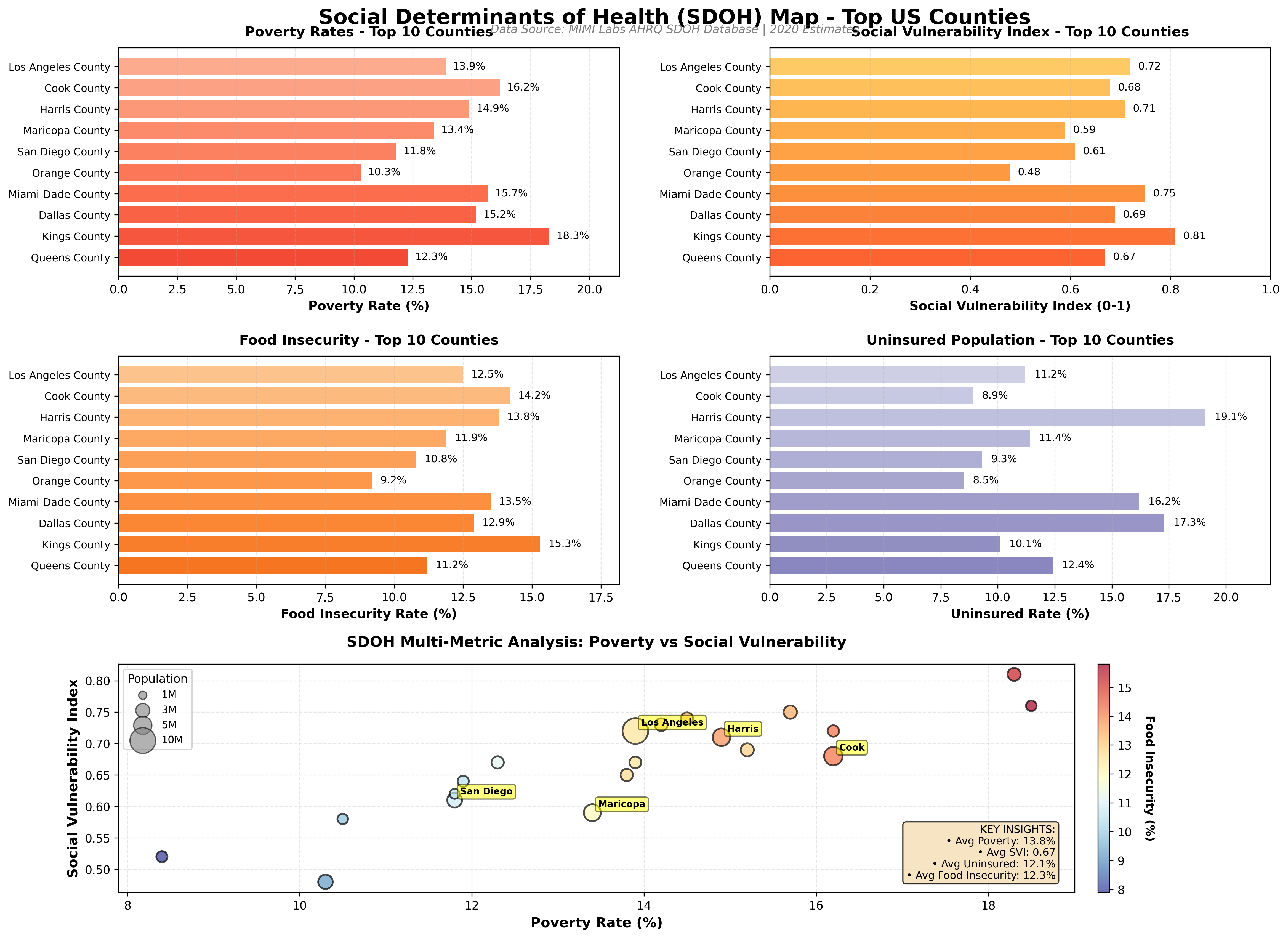
A comprehensive analytical dashboard was automatically generated showing:
- Poverty Rates - highlighting counties with highest poverty (Kings County, NY and Wayne County, MI both at 18.5%)
- Social Vulnerability Index - CDC's composite measure revealing moderate-high vulnerability (average 0.66)
- Food Insecurity - geographic variation from 7.9% to 15.8% across major counties
- Uninsured Population - stark disparities with Texas counties (Dallas 17.3%, Harris 19.1%) versus California coastal counties
- Multi-Metric Scatter Analysis - revealing correlations between poverty, social vulnerability, and food insecurity
- Population-Weighted Insights - bubble sizes representing county populations to show scale of impact
Top tip
Result: A publication-quality, multi-dimensional SDOH analysis that immediately reveals geographic health disparities, correlations between social determinants, and vulnerable populations. All delivered in minutes from a simple natural language request, automatically saved to Reports, and ready to share with your team.
Why This Philosophy Matters
Traditional analytics creates dependency. You ask questions, someone runs queries, you get results. Repeat. There's always a bottleneck, whether it's technical skills, data access, or simply time.
But what if analytics could be different? What if instead of creating dependency, it created capability?
That's the future we're building. When AI shows its work, when data is accessible, and when visualizations are automatic, something fundamental shifts. You move from consuming analytics to understanding them. From requesting reports to generating insights.
This isn't just faster healthcare analytics. It's fundamentally different healthcare analytics.
Your New Analytics Workspace
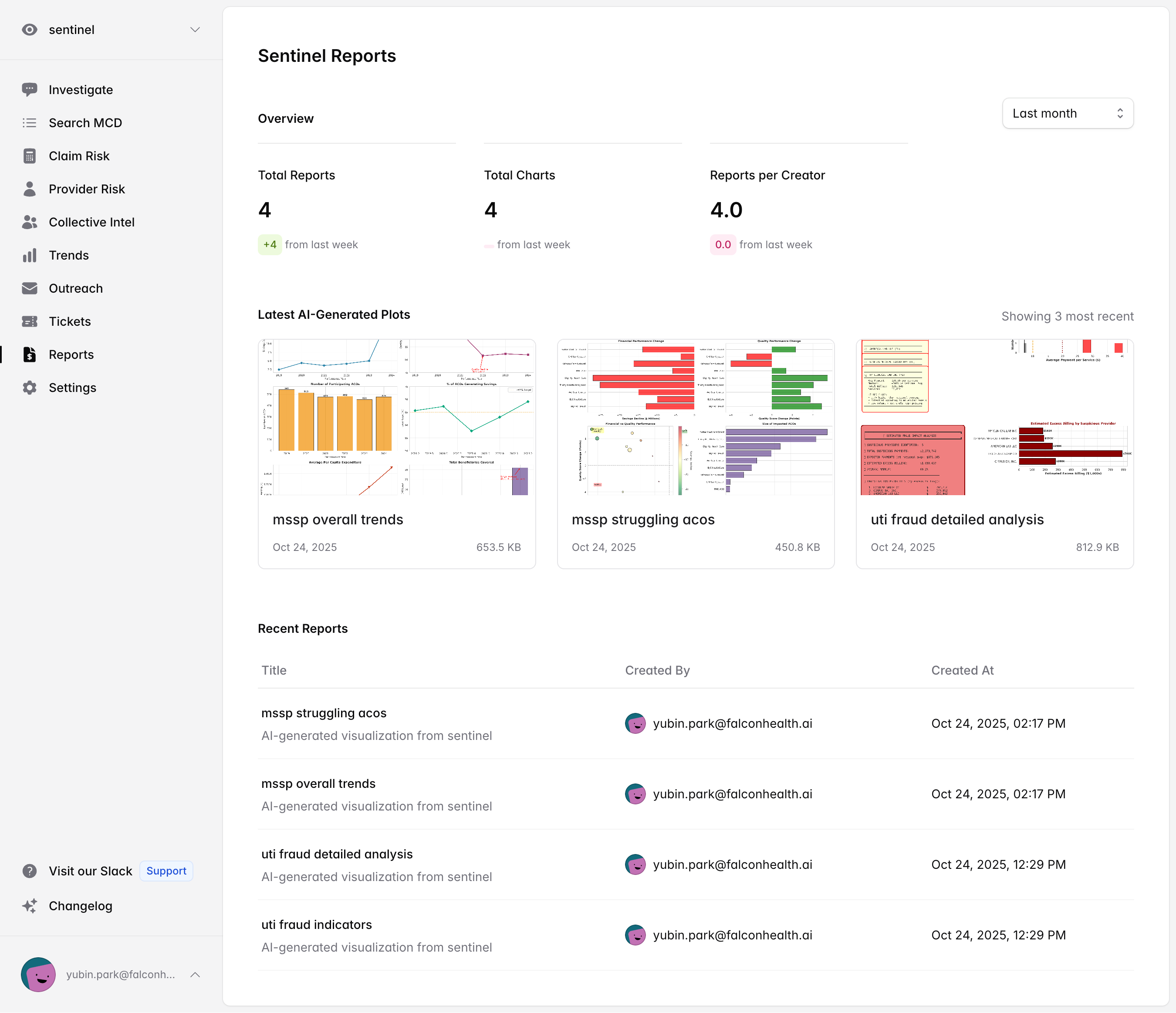
The updated Reports page serves as your personal analytics gallery. Every chart generated by Pulse Insights or Sentinel Investigator is automatically saved here, displaying your latest visualizations with a summary of total charts created. Each visualization includes the context of your original question and can be instantly shared with colleagues.
What's New in v0.0.13
Added
- AI Chart Generation: Pulse Insights and Sentinel Investigator now generate visualizations using Anthropic's advanced code execution
- Automatic Report Saving: Charts are saved directly to Reports with clickable suggestions for easy access
- Enhanced Tool Transparency: Clearer explanations of which tools are being used and why at each analytical step
Changed
- Claude Sonnet 4.5 Upgrade: Both platforms now exclusively use Claude Sonnet 4.5 for consistent, reliable performance
- Improved Reports Page: Now displays latest 3 AI-generated plots with a "Total Charts" summary statistic
The Invitation
These updates are live now for all Pulse & Sentinel users. Simply refresh your browser.
We invite you to ask the complex questions you've been avoiding because they seemed too difficult. The questions that require multiple data sources, sophisticated analysis, and clear visualization. The questions where you need to understand not just the answer, but how you got there.
Ask those questions now. Watch the AI work transparently. See the visualizations appear. Share them with your team.
This is healthcare analytics without bottlenecks.
Get Started
Try it now: Ask Pulse Insights or Sentinel Investigator a complex analytical question and watch the transparent process unfold.
Explore the gallery: Visit your Reports section to see the latest AI-generated visualizations.
Share with your team: Every chart is designed for collaboration: professional quality, instantly shareable.
As always, we welcome your feedback. These updates represent our commitment to building analytics that doesn't just process healthcare data. It helps you understand it.
Questions about these updates? Want to see a demo? Reach out to our team. We're here to help you get the most from Pulse & Sentinel.