A Map of Medicine Hidden in Billing Data
by Yubin Park, Co-Founder / CTO
Claims data usually looks like a table of providers, procedure codes, dates, and amounts. But a procedure is rarely billed alone. The other services billed by the same provider can reveal the type of practice, care setting, and patient population behind it.
We used those recurring patterns to build the map below. It contains 3,613 Medicare procedure codes. Codes appear close together when they tend to be billed by similar providers—not because their written descriptions sound alike. Colors show broad service categories, larger points represent more widely used codes, and open rings mark rare, high-cost codes.
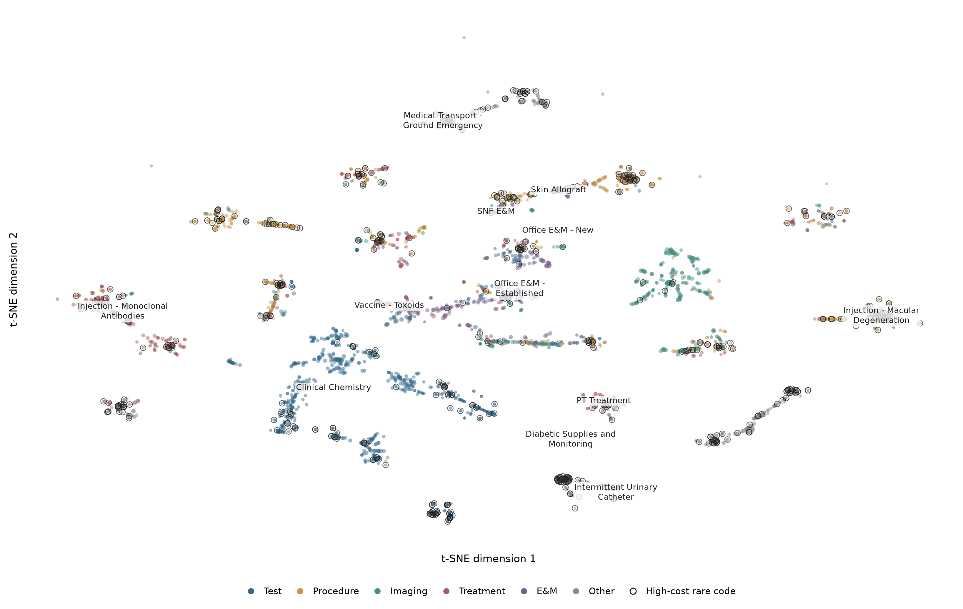
The map separates into recognizable neighborhoods such as laboratory testing, imaging, office visits, infused therapies, durable medical equipment, and wound care. Three patterns stand out.
Skilled nursing care and the skin-substitute surge
Skilled-nursing-facility visit codes sit close to skin-allograft codes. That makes practical sense: nursing-facility patients often have chronic wounds, limited mobility, diabetes, or vascular disease, and facility-focused wound-care practices may bill both types of service. The important point is that the model found this relationship from billing patterns alone.
This connection deserves attention because Medicare Part B spending on skin substitutes rose from $252 million in 2019 to more than $10 billion in 2024. CMS linked much of the increase to product prices and proposed changes to how these products are paid (CMS, 2025). HHS-OIG also reported much higher costs for patients treated at home than in offices (HHS-OIG, 2025). In 2025, DOJ filed a complaint alleging unnecessary services and overbilling by a wound-care organization serving nursing facilities; those allegations have not been proven in court (DOJ, 2025).
The map does not show that a provider did something wrong. It shows analysts where to ask better questions—for example, whether spending or applications rose suddenly, which products were used, where patients were treated, and whether the records support the frequency and duration of care.
New and established patients occupy different neighborhoods
Office evaluation-and-management codes for new and established patients form separate neighborhoods on the map, even though both describe office visits. The difference may reflect how a practice operates: established-patient codes are common when a practice manages the same patients over time, while new-patient codes may be more common in consultations, one-time specialty visits, or rapidly growing practices. This does not indicate a problem by itself, but it gives analysts a useful comparison: measure each provider's share of new-patient visits against similar providers, then review unusually high or rapidly changing ratios alongside referrals, repeat visits, and other billed services.
The urinary-catheter island
Intermittent urinary-catheter codes form a small, isolated island. This likely reflects a specialized group of durable-medical-equipment suppliers that bill a narrow set of related codes.
The pattern matters because catheter billing has become a major Medicare concern. HHS-OIG estimated that $35.1 million of the $303.3 million paid during its audit period was improper. It also found 125,426 claims for curved-tip catheters supplied to female beneficiaries in 2023, up from 2,753 in an earlier audit period (HHS-OIG, 2025). DOJ later alleged that one organization submitted $10.6 billion in fraudulent claims for catheters and other equipment using stolen identities (DOJ, 2025), while HHS-OIG warned consumers about “free” catheter schemes involving unnecessary or undelivered supplies (HHS-OIG consumer alert).
Again, the cluster does not prove fraud. It points to practical checks such as sudden supplier growth, units per patient, ordering-provider relationships, refill timing, proof of delivery, and use of higher-reimbursed catheter types.
How the map was learned
We first build a table showing which procedures each provider bills. Positive pointwise mutual information, or PPMI, gives more weight to procedure pairs that appear together more often than expected. Nonnegative matrix factorization then reduces those relationships to 32 numbers for each code.
Those numbers can also help suggest procedures that fit a provider's existing billing pattern. In validation, the model recovered 44.7% of held-out procedures within its top 10 suggestions, compared with 35.9% for a simple popularity baseline. For rare, high-cost codes, it recovered 51.8% within the top 50 suggestions, compared with zero for popularity. It performed slightly worse on overall recall at 50, so the model is useful for this specific goal—not every prediction task.
The figure uses t-SNE to turn the 32-dimensional representation into a two-dimensional picture (van der Maaten and Hinton, 2008). Nearby points are meaningful, but the axes and long-distance gaps are not. Actual similarity calculations use the full 32-dimensional data. This is also a map of procedure codes, not providers; provider-level conclusions still need to be tested against billing records.
What the map contributes
A medical taxonomy groups procedures by what they are. This map groups them by where and how they are billed. It cannot discover fraud on its own, but it can show where activity fits, where it is changing, and which services deserve a closer look. Combined with spending, timing, patient support, documentation, and provider relationships, it helps turn millions of billing rows into a smaller set of questions analysts can test.
Project methodology and supporting material
We’re preparing a comprehensive white paper detailing the methodology behind this work. Coming soon.